
Folders, transparent menus, curved edges and more.
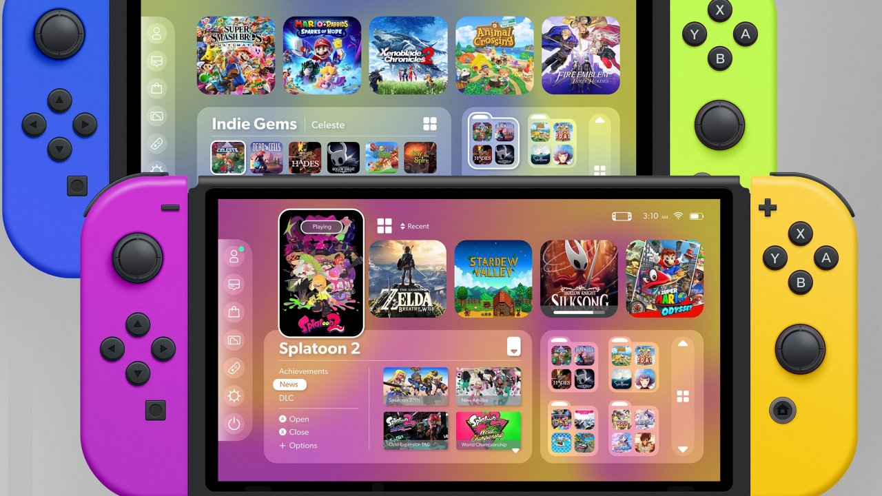
Since the arrival of the Switch, users have been calling for Nintendo to enhance the interface of the hybrid system. One of the top requests is the addition of folders, but apart from this, fans would also like to be able to change background colours and even replace them with wallpapers.
Although there’s no sign we’ll be getting any of this in the future, that hasn’t stopped some fans of the Switch from imagining what the device’s UI could potentially look like if Nintendo was to freshen it up. The latest redesign by Reddit user ‘porcorousseauu‘ appears to draw at least some inspiration from the UI on Apple’s mobile and tablet operating system, iOS.
Read the full article on nintendolife.com


